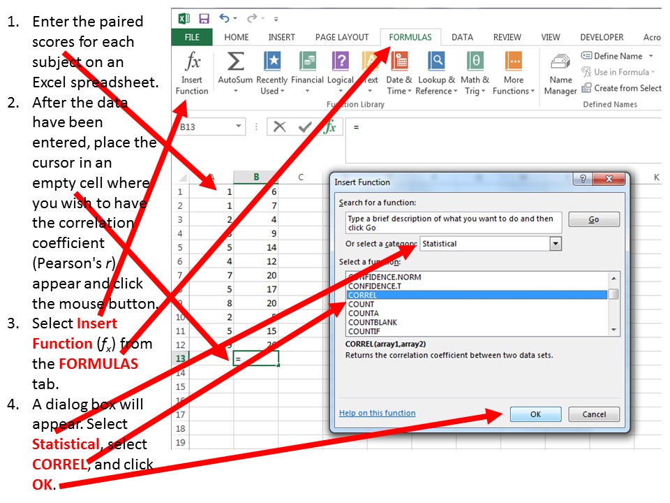
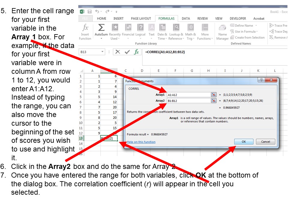
Calculating Pearson’s r Correlation Coefficient with Excel
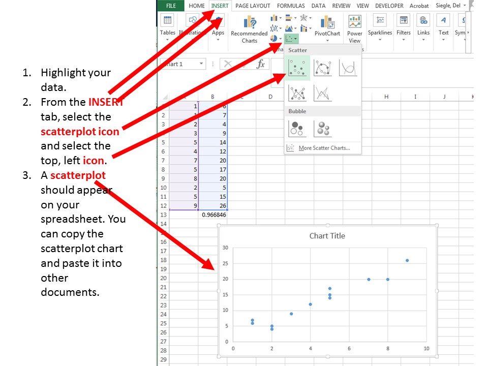
Creating a Scatterplot of Correlation Data with Excel
Web cookies (also called HTTP cookies, browser cookies, or simply cookies) are small pieces of data that websites store on your device (computer, phone, etc.) through your web browser. They are used to remember information about you and your interactions with the site.
Session Management:
Keeping you logged in
Remembering items in a shopping cart
Saving language or theme preferences
Personalization:
Tailoring content or ads based on your previous activity
Tracking & Analytics:
Monitoring browsing behavior for analytics or marketing purposes
Session Cookies:
Temporary; deleted when you close your browser
Used for things like keeping you logged in during a single session
Persistent Cookies:
Stored on your device until they expire or are manually deleted
Used for remembering login credentials, settings, etc.
First-Party Cookies:
Set by the website you're visiting directly
Third-Party Cookies:
Set by other domains (usually advertisers) embedded in the website
Commonly used for tracking across multiple sites
Authentication cookies are a special type of web cookie used to identify and verify a user after they log in to a website or web application.
Once you log in to a site, the server creates an authentication cookie and sends it to your browser. This cookie:
Proves to the website that you're logged in
Prevents you from having to log in again on every page you visit
Can persist across sessions if you select "Remember me"
Typically, it contains:
A unique session ID (not your actual password)
Optional metadata (e.g., expiration time, security flags)
Analytics cookies are cookies used to collect data about how visitors interact with a website. Their primary purpose is to help website owners understand and improve user experience by analyzing things like:
How users navigate the site
Which pages are most/least visited
How long users stay on each page
What device, browser, or location the user is from
Some examples of data analytics cookies may collect:
Page views and time spent on pages
Click paths (how users move from page to page)
Bounce rate (users who leave without interacting)
User demographics (location, language, device)
Referring websites (how users arrived at the site)
Here’s how you can disable cookies in common browsers:
Open Chrome and click the three vertical dots in the top-right corner.
Go to Settings > Privacy and security > Cookies and other site data.
Choose your preferred option:
Block all cookies (not recommended, can break most websites).
Block third-party cookies (can block ads and tracking cookies).
Open Firefox and click the three horizontal lines in the top-right corner.
Go to Settings > Privacy & Security.
Under the Enhanced Tracking Protection section, choose Strict to block most cookies or Custom to manually choose which cookies to block.
Open Safari and click Safari in the top-left corner of the screen.
Go to Preferences > Privacy.
Check Block all cookies to stop all cookies, or select options to block third-party cookies.
Open Edge and click the three horizontal dots in the top-right corner.
Go to Settings > Privacy, search, and services > Cookies and site permissions.
Select your cookie settings from there, including blocking all cookies or blocking third-party cookies.
For Safari on iOS: Go to Settings > Safari > Privacy & Security > Block All Cookies.
For Chrome on Android: Open the app, tap the three dots, go to Settings > Privacy and security > Cookies.
Disabling cookies can make your online experience more difficult. Some websites may not load properly, or you may be logged out frequently. Also, certain features may not work as expected.